Featured Post Today
print this page
Latest Post
Showing posts with label interior design school. Show all posts

Term 5 Final Project: Advanced Residential / Piano Mansion

Do you all remember me talking about my major studio project for the fall, and then basically disappearing off the face of the blogging earth? Well, let's just say that this project consumed and challenged me more than any project to date, but that the satisfaction of completing it (and getting a great mark) was well worth the long hours, piles of discarded ideas, and even tears.

If you recall, my original concept for the house was the piano (as the client is a family of musicians), but as I developed the project further, I moved away from such a literal shape and idea into a larger concept of the stage and performance, into a liveable concert hall idea. I kept some of my original concept, such as the pitched roof, but basically, I wanted the home to capture and reflect the feeling of grandeur associated with attending a night at the theatre, as well as creating a liveable environment that was simultaneously conducive to entertaining, parties and performance. Here is the final result (click on photos to see them in larger format):
I was basically architect, structural engineer, landscaper and interior designer for this project and I also had to consider barrier free elements as one family member is in a wheelchair...did I mention the plot of land we were given was on a cliff like hill? That's a lot of hats to wear in ten short weeks, but I am so happy I pulled it off and proud of myself for not giving up!

Here's to a new term! xo
Photobucket

Advanced Residential Project Inspiration: Piano Room & Sketches

First and foremost, I want to send a huge thank you and a warm hug out to each and every one of you for the overwhelming amount of support, encouragement and positive messages that I received through the blog, instagram and e-mail regarding yesterday's post. My heart is so full at the thought of this community and all we do for one another. :) You are the best.

Now onto a more fun topic. Last week I shared some details on this term's design studio - a 4000 square foot residential property which we get to design from the ground up. We received the program and the occupants are a family of talented musicians. They have a grand piano.
I actually took piano lessons when I was younger and while I never made it too far (I always hated practicing when I could be outside playing) I still plan on taking my piano with me into my first real house. All of this led me on a hunt for some piano room eye candy.
Stacey Brandford Photography via Desire to Inspire
via Robert Brown Interior Design
Atlanta Homes and Lifestyles via Little Green Notebook
I'm consulting with a talented piano playing young man (we will call him M.) on this project as a client sounding board. He says he would want a wood coloured grand piano, rather than black. Something like this I'm thinking...
via Markdsikes
I mean, burled wood? Let me pick my jaw up off the ground. Simply stunning.

 And while I know last week I said that my favourite old house is the direction I wanted to go in architecturally, I am now considering really running with this piano concept. I've sketched up some ideas for the shape of the house inspired by the shape of the piano and am really digging it. Realistically when am I ever going to be able to design a budgetless custom mansion? NEVER! Why not push myself to do something outside of the box? Here's a peek at my initial brainstorming work:
I might have to start practicing again, feeling inspired! Do you play an instrument?
xox
Photobucket

Term Four Final Project (& Tips for Creating your own Design Boards)

I did it! I survived my fourth project week.
This one was a big one - Each term more is expected of us as our knowledge base grows. I can't believe I'm officially 1/3 done my degree already. How time flies!
Today I thought I would share my final project and some tips for creating professional looking design boards (for all those fellow design students following my blog! xo)
 1. Be consistent. All of your boards should look exactly the same if you were to take all of your images off of them. I like to prepare my boards with a grey background (complimentary to almost anything & allows your work to shine) and a second pop of colour that goes with the scheme of my design. In this case a fresh, minty green.
2.Don't overcrowd your boards. It will overwhelm the viewer and look messy! Also, everything you put on your board should be mounted on a piece of foam core to create dimension and layers. Shout out to the lovely Steph Sterjovski- I used her picture as the perfect 'mint shopper' inspiration!
3. Your first board should always outline your design concept. Use a small group of images & the concept statement. I also like to highlight the three key words that illustrate the feeling I am trying to create with my design.
4. Use a title block at the bottom of each board with your name & class title, board title, and board number.
 5. Your renderings should be the stars of the show. They will pop more if they are surrounded by a black boarder.
 6. Try not to put all of your boards together in one day or by your eighth board things might start getting a little crooked and sloppy (see above ^).

 7. Always dress to match your boards. Just do it.
Warnings: Doing these boards is costly, time consuming, and will result in major 'designer bags'...and not the good kind of designer bags. I'm talking the ones under your eyes here people. Proof is in the pudding:
I'm very proud of how far I've come in one short year!! I can't imagine where I will be when I graduate. This week I am visiting my parents in Waterloo before term 5 starts on October 7th!
xoxo
Photobucket

Currently Learning: Sketch-Up

This term we are finally learning to use Google Sketch-Up! I am so in love, even though I'm just a newbie. I would describe it as Sims for adults. Let's be real - even as a child all I ever did on Sims was build and decorate the houses. Anyone else? Basically this has been consuming all of my time this week so I thought I would share my progress with you guys. This term my studio project is retail design, and I'm designing a clothing retail shop including designing all of the branding. I called my line 'Mint' and am bringing it together in 3D! Here are some 'work in progress' shots:


My favourite touch has got to be the mint candy wallpaper that I custom designed for the store.
The 'i' on my logo is dotted with the same candy. So presh!
Do any of you use Google Sketch-Up?
Speaking of mint...don't forget to enter the $50 Minted Giveaway that I have going on right now!
xo
Photobucket

Evolution of a Drawing

I must apologize for neglecting this blog all week. Quite simply I've been busy and uninspired.
Quality over quantity sometimes, you know? But today I'm back with an inside look at the evolution of a drawing to create this finished result:
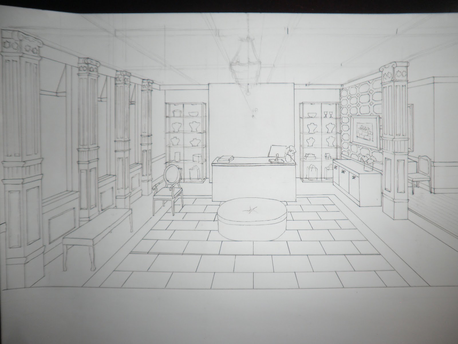
 This is the reception for Tiffany & Co. head office that I designed for my term 3 rendering class. You can see that the paper is a bit crinkled, but once I mount it to foam board for the presentation you won't see that.
Step 1: Start with a floorplan

Step 2 (to like...1000)
The next part is complicated and not something I could explain here in less than a thousand words. But basically you need to draw a station point (where you would be standing in the room), as well as a picture plane (along the back wall). You start transferring all the items to the picture plane and then down onto your new drawing using the vanishing point. I know that explanation was weak and makes no sense. You can youtube it.
 (You can see all of the lines 'raining' down from the floor plan that is taped above it. you mark the height and location of the objects on the back wall and extend them forward through the vanishing point to get the correct proportion.

Step 3 (or 1001)
Once everything is drawn in, I start to trace over the lines of the objects. At this point there are MANY unnecessary lines on the paper. Rather than carefully erase each one, I just trace over the lines I want to keep in marker and then do a big, fast erase after.

Finally, I make several photocopies just in case I end up messing up on the coloring stage, and then I have at er! First start with shading using French Gray prismacolors, then add the rest.
And voila!
Missed you all!
Photobucket
 
Copyright © 2011. Interior Designs - All Rights Reserved
Template Created by Creating Website Published by Mas Template
Proudly powered by Blogger